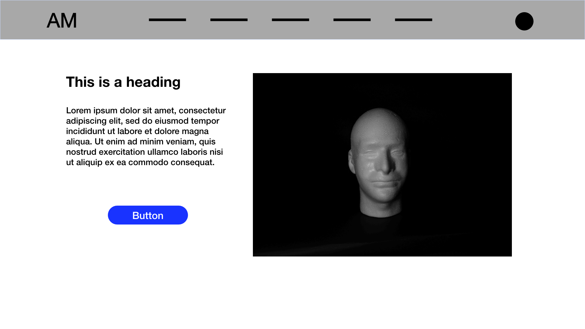
Here's an example of a common component pattern:

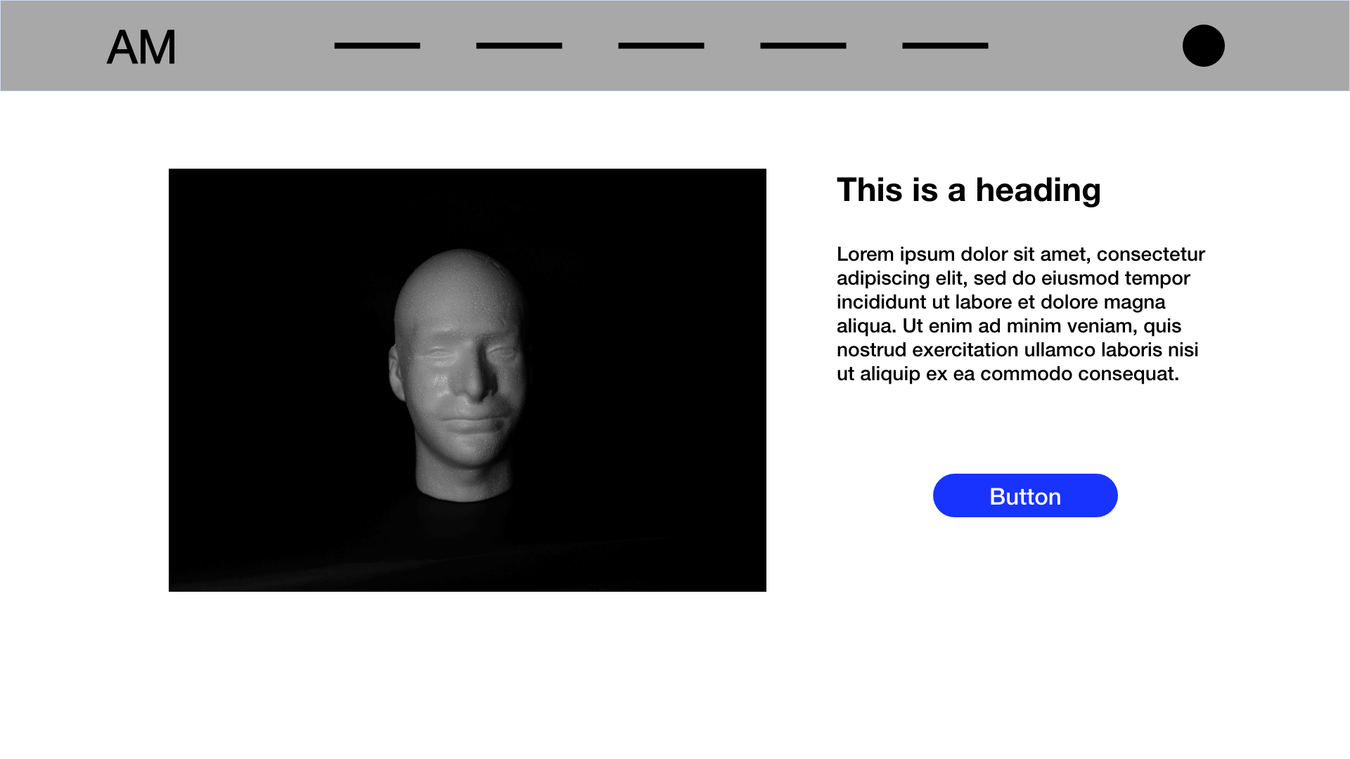
A variation with image on the left and text on the right:

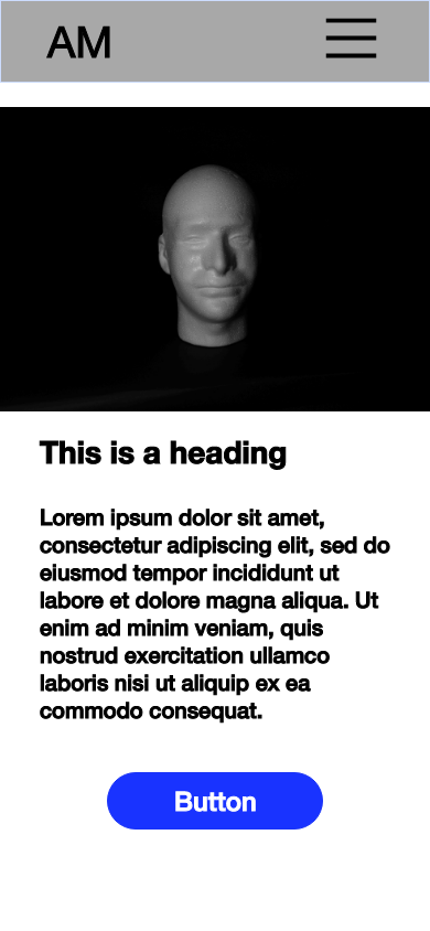
And mobile:

When you study content patterns in components, you'll likely find that many components contain the same four fields:
- Heading (h2-h6 tags)
- Text
- Button (Link)
- Media (Icon, Image, or Video)
Common components containing this pattern include:
- Banners
- Cards
- Text and Media
- CTA (Call to Action)
While the fields are the same in each component, the arrangement of the fields change. This is where templates come into play.
To design components, we incorporate the principles of Atomic Design by Brad Frost. Once designed, we start building the atomic elements that will be added to the component. Components are then added through Layout Builder to build out a page.