Before starting work on the custom block, we should create the Heading component. This allows us to place a component within a component. For this, we'll use a Paragraph type that we will create.
Add a Paragraph type called Heading
Go to Structure -> Paragragph types -> Add paragraph type
- Label: Heading
- Description: A heading component that can be used as a single title. Options are Style; h2 - h6.
Click the Save and manage fields button.
Add fields to the Heading paragraph type
You'll now be on the page where you manage the fields.
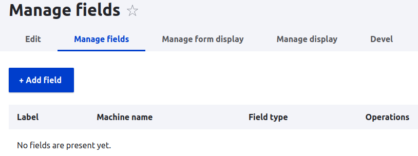
Click the Add field button
From the Add a new field drop-down, scroll down to and select
- Text: Text (plain)
- Label: Heading title
Click the Save and continue button
- Maximum length: 255 (default)
- Allowed number of values: Limited / 1
Click the Save field settings button
You now have a form where you can add a description or make the field required. You'll likely want to make the heading a required field when it's in production, but during development testing, it can slow you down. You can come back later and update the field.
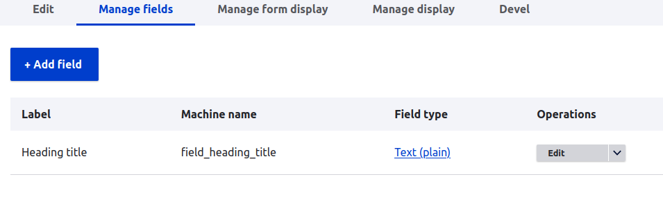
The Manage fields screen should look like this
Click the Add field button
From the Add a new field drop-down, scroll down to and select
- Text: List (text)
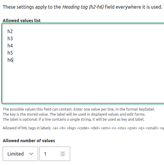
- Label: Heading tag (h2-h6)
Click the Save and continue button
Now you can add the values that the content editor can chose from.
Click the Save field settings button
On the next screen, you can add a description, default value and mark the field as required.
The Heading paragraph is now complete for our purposes.
NOTE: While there are other field options for the title and style, for the purpose of introducing component building, the fields have been kept most basic. For example, the title could be a formatted field that uses a WYSIWYG.
The style list could be contained in a Vocabulary and content editors would see a list of Taxonomy terms. But, accessing that value inside a Twig template gets a bit trickier. The purpose here, is to keep things simple and help you get comfortable with the process of creating components.